A Dental Signage Emergency!
As you can tell, our patient was in a lot of pain! Broken and discolored, this old wall sign was in need of immediate extraction! Our only problem? Not having a replacement design. The Dental Specialties Center did not have a logo to work from, only different colored building entrances to their suites. So, we started doing what we do best: designing a custom wall sign!
Project Details
Client Dental Specialties Center
Date June 2017
Skills Logo & Custom Sign Design
Project Planning
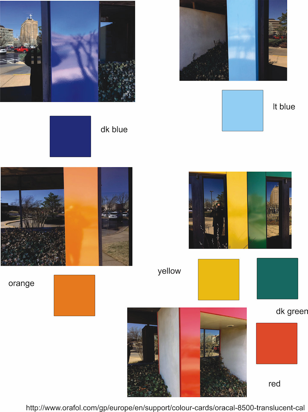
The accompanying image is from preliminary research into exactly how many colors we needed to design into the logo sign. Fortunately, our customer gave us some basic direction: The three main colors to use with the three main initials, DSC. After multiple iterations, we came up with a few typeface examples, and the basic color theme.
Design Decisions
Final Corrections
Our final design resulted in an attractive custom logo sign, and another satisfied customer! However, we were not completely happy with our result. The white letter D virtually disappeared into the yellow background. It was not acceptable. We approached our customer about the problem, and asked if we could put a black outline around all of the letters so they would be more distinguishable. We created another 2-dimensional proof of the artwork, and after receiving the go-ahead, we installed the black outlines.


