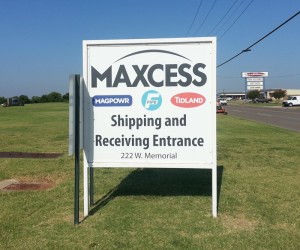
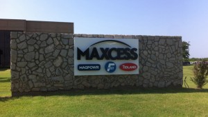
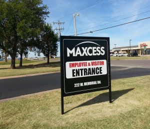
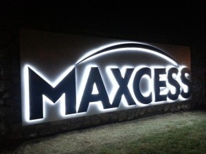
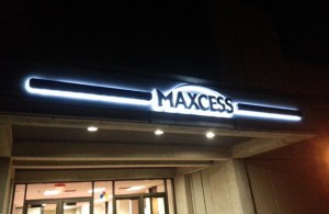
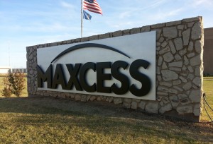
Making corporate logos into monument signs and illuminated architectural elements hits right at the heart of what Electremedia is designed for: to integrate corporate branding into visual advertising, and exterior signage in particular. Maxcess International recently updated their corporate logo, removing the subsidiary graphics. They wanted a new look, so we gave it to them. The results are one of my favorite.
Replacing Existing Signage
Maxcess had existing signs they wanted replaced with just the name Maxcess. These consisted of two different entrance signs, a lobby wall sign, a canopy sign and a large monument sign.
Designing the Replacements
Since we only had “Maxcess” to work with, the design was pretty clear: go big. We provided a few size and face illumination options, and ended up going with a 17-foot halo illuminated channel letters offset on a back pan. The canopy sign was a challenge, as with the limited height of the face area, the logo would have only taken up a small portion of the center. We decided to use halo illuminated bars that extend from each side of the logo. The result turned out beautifully.
If you would like more information on obtaining your own custom storefront sign, please call us at (405) 471-4299, fill out our Quote Request Form, or send us a message through our Contact Page.

